We have looked at the website and charity highlights for 2016, now we are looking at some big projects which have really stood out over the course of the year.
Penarth Post
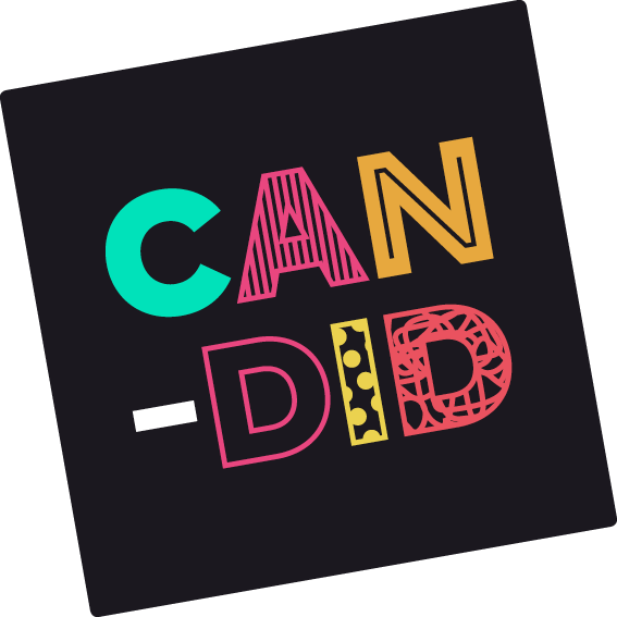
2016 has marked the launch of Penarth Post, the first issue released in August pronounced the arrival of this hyper local delivery service created by Candid. Each month since has seen a collection of quality local businesses, offers and events packaged and distributed to selected addresses in Penarth. With different demographics targeted each month this is an opportunity for the businesses that we work with to reach their clients in an extremely targeted, affective and affordable way.
Each month the businesses are packaged within a bright yellow envelope and posted out to residents. As an additional incentive a golden ticket with a prize is inserted into one of the envelopes.

Hello Cabaret
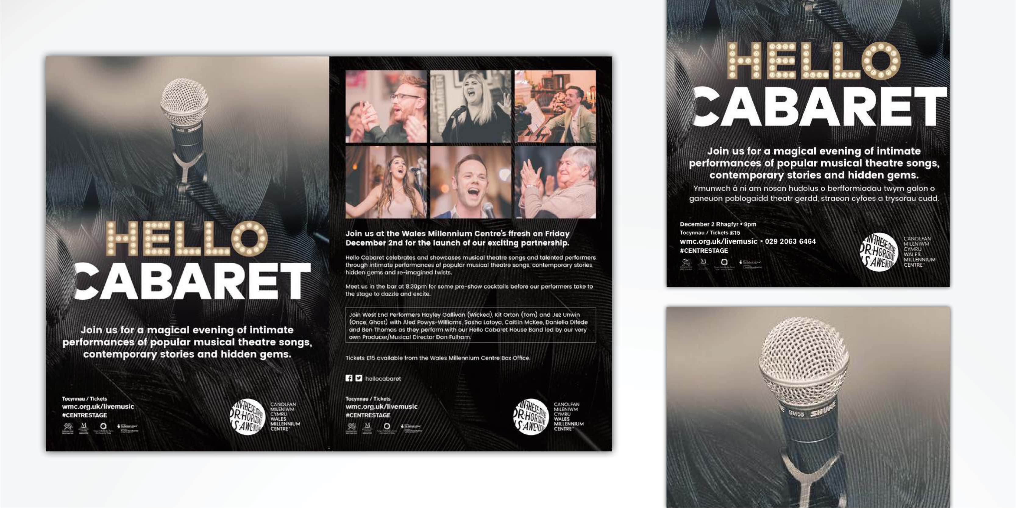
May marked the launch of Hello Cabaret, a monthly event celebrating musical theatre and Welsh voices. As lovers of all things Welsh and musical we were delighted to take on the logo branding and marketing for this event! The brand emanated glamour and class so velvety black backgrounds were used and the programmes were printed on a double velvet laminated card.
Earlier this month Hello Cabaret moved over to the Wales Millennium Centre and we look forward to helping this brand grow and develop even further over 2017.
Farthinghoe fine wine
This year we embarked on the tremendous task of redesigning and rebranding the 70 page wine catalogue for Farthinghoe fine wine limited.
This family run business established in 1975 offers classic European wines worldwide and was in need of a new look to bring it up to date with modern trends and technologies.
Their clients have a varying degree of knowledge of wines and with the list featuring over 500 variations it was crucial that the list was legible and easy to navigate through whilst portraying the bespoke, friendly essence of the brand.
We simplified the font and used colour, size and weight to create contrast and ease of navigation. العاب اون لاين Upright font was used throughout to portray the new contempory style of the catalogue.
The styling elements flow throughout the whole list as it navigates through the wine regions with bold headings and region titles down the side of the pages-giving it a clear contempory style. 365 رياضة
White space between the listings allowed the information to stand out and images were used to depict the magic of the vineyards and bring the pages to life. بديل الروليت
As a bi-annual wine list we look forward to more projects with Farthinghoe in the new year.
