A logo is an integral part of every business’s branding strategy and as the saying goes; a picture paints a thousand words. Your logo can speak volumes about your brand and is often overlooked at the start. Many new business owners are so busy and eager to get going, that little thought is given to their brand identity, but we live in a visual age, and your customers expect an easily recognisable and characteristic brand image. The ability to channel the right message and associations will stand you apart from your competitors in a crowded marketplace and future-proof your brand.
There are many things to think about when designing your new logo and one of the consistent factors that we consider, regardless of the client we are working for, is versatility. You may have only just established your business and will therefore, only be looking to use your logo on a few flyers or business cards, but what happens as your company grows? Year on year, you will inevitably be adding extra services, maybe a website or an app, leaflets or brochures, and your new logo needs to be adaptable for all of these. You should also be able to tweak the colours without losing impact, or take out colour all together.
So it’s a new year and a new start, and if you were planning on refreshing your logo or setting up the business you have always dreamed of, then take note. We have put together a list of the top 5 logo trends that are set to rule the roost in 2016.
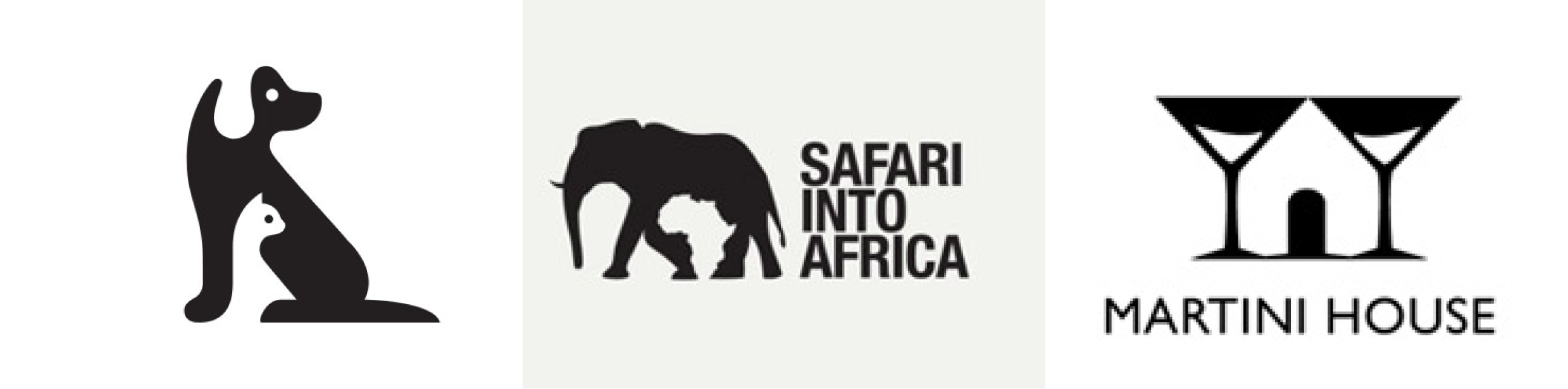
- Negative Space
This trend continues to build upon the minimalism movement that we have seen in graphic design over the past few years- sometimes, less is more. The use of negative space can produce interesting logos that grab the viewer’s attention and inevitably, the more time they spend concentrating on the picture, the more likely they are to remember it. This trend works especially well for black and white logos as it adds a bit of spice to something that would otherwise be quite boring. Logos using negative space will enable the consumer to reveal a deeper message behind the brand too.
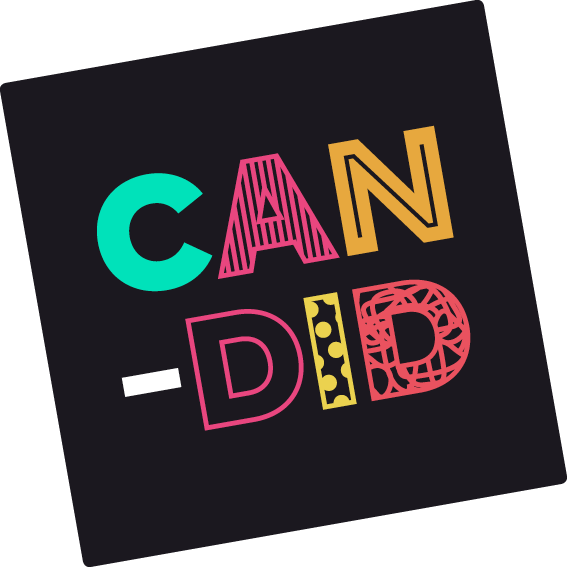
- Crafty Hand-made
This trend conveys honesty and intimacy and has been gaining popularity for a few years now. The usage of scribbles, signatures, arrows and swirls suggest the ideal of being handmade and utilise this charm, whilst still appealing to a digital generation. Bespoke fonts are often used within this trend and emphasizes that typography is not just the style of the text, it is the voice, the language and the personality of the brand. Recent years have seen consumers lean back towards local, small businesses and a handmade logo will present a reliable and caring image.

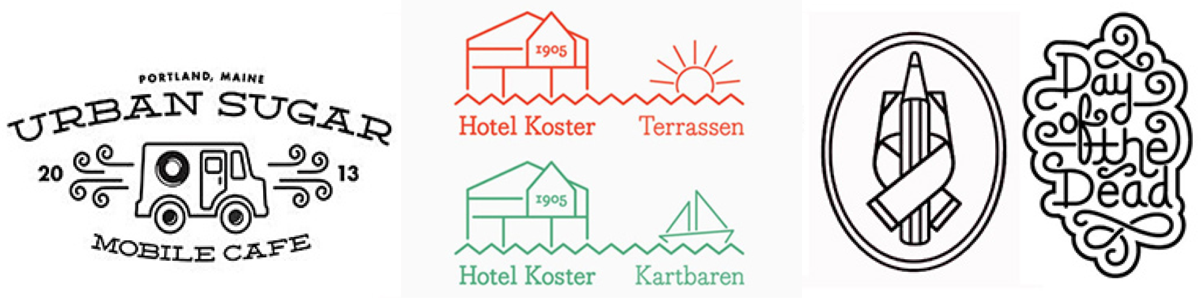
- Monoline
Thin clean lines present a fresh look in this trend. Representing something like a wire, this trend makes a simple design into something far more intricate and beautiful. Whilst hinting to the ‘handmade’ feel, this trend is slightly more ‘put-together’. Monoline logos offer a welcome break from the block colours and gradients that have dominated the industry over the past few years. They are simple, easy to read and give a nod to emoji’s and memes which currently rule the internet.
- Typography and Script
Your logo is likely to display your company name, and bold typography offers a unique and captivating way of displaying this. By using a script font in your logo, you can add drama and personality to your brand without making your image too complicated or busy.

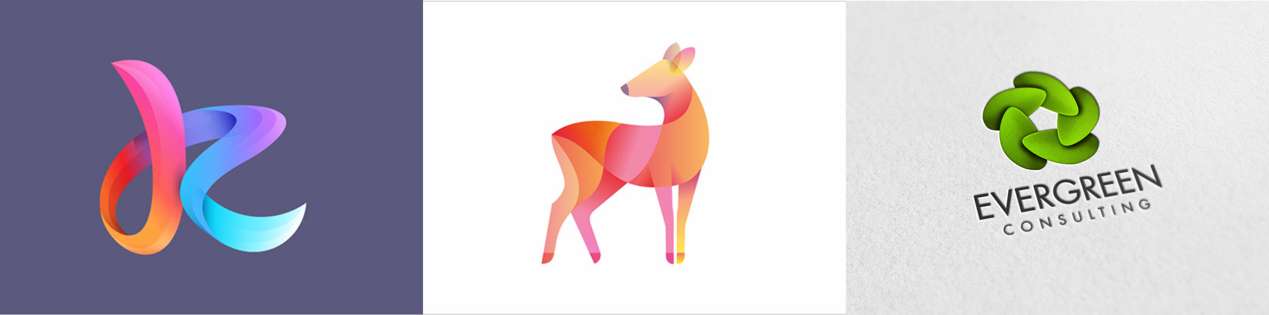
- Overlapping
Bright, shiny colour schemes work the best with this trend. Overlapping gradients adds another dimension to your logo and brings it into the digital age. Shadowed logos grab the viewer’s attention and can take your original brand image from simple and minimal to sophisticated and stylish.