
Local talent agent, Shelley approached us a few weeks ago with not just one, but two new start up projects developing a new performing arts hub and casting agency. The challenge was to create two new, innovative brand images that would appeal to two very different audiences, but married well together under the Shelley Norton Stage School and Management umbrella.
Shelley Norton Management
Shelley Norton Management would act as the umbrella covering The Talent Shack, and needed to present a professional, clean-cut image to casting directors looking for talented and unique individuals.
Our initial thoughts after meeting Shelley for the first time were that her unique look and personality would be essential in developing an innovative, creative brand that people would instantly recognise and relate to. From this, we began to consider why will performers sign up to Shelley’s agency and what will make industry professionals decide to hire from her? The reason for both would not be because of the agency’s facilities or track record; it would be because the famous Shelley Norton is behind it!
This essentially, is what differentiates Shelley Norton Stage School and Management from its competitors – the fact that Shelley herself glues it all together.
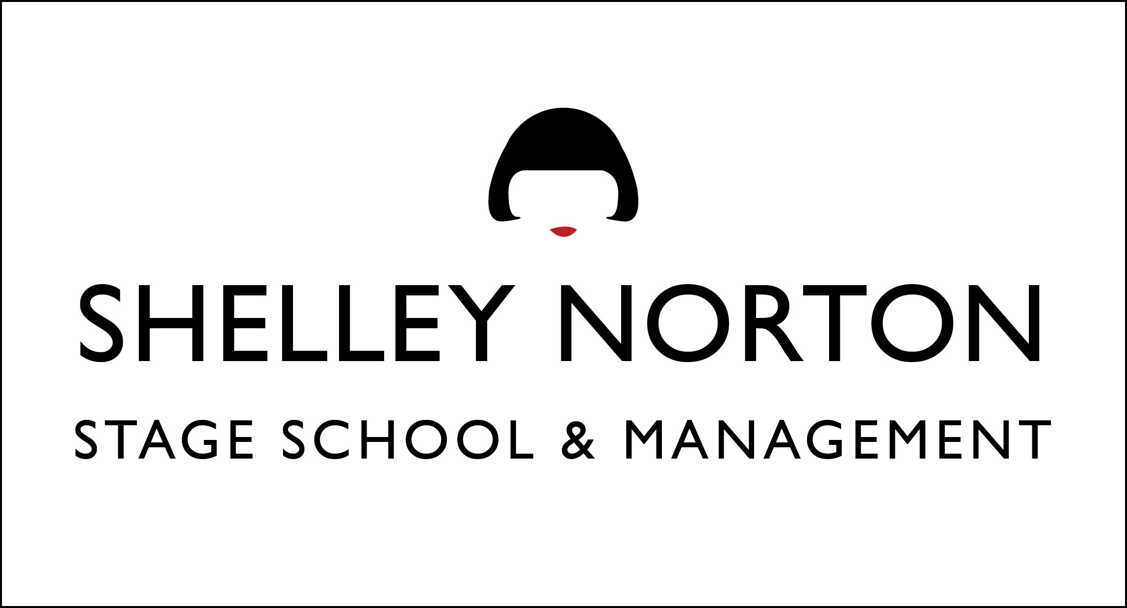
The final logo embodies this message from head to toe, literally putting a ‘face to a name’. By incorporating Shelley’s signature bob and red lipstick, we created a logo that screams individuality whilst still maintaining an all-important degree of professionalism. The logo fully reflects the agency’s message to it’s members – that it’s okay to be different and actually, its important to celebrate what makes your stand out from the crowd.
The Talent Shack
The branding for The Talent Shack, needed to stand alongside Shelley Norton Management but appeal to a very different group of people. Although preparing children and young adults for the industry, the Talent Shack is more of a hub than an agency – a community of performers having fun together. It’s image needed to be playful and bold, it needed to appeal to a wide age range, and most importantly, it needed to represent a place that children and young adults alike, would be proud to go to every weekend.
The final logo draws inspiration from the building itself, taking the simple silhouette of the roof whilst reflecting a rickety wooden ‘shack’ which adds a level of playfulness to the design. The scribbles and lines echo panels of wood, hammered together haphazardly to create a structure. Whilst the content of the logo could be considered quite busy, the shapes and lines are simple allowing it to create equal impact even when converted in to one colour way, making it perfect for use on hoodies, t-shirts, bags, wristbands and other promotional material.
![]()
For more information about Shelley Norton Stage School and Management and the Talent Shack head online:
Fancy a chat about how you could develop your brand image? Email me at beth@candidcreative.co.uk