
Bengo Media is an audio-first production company offering podcasts, radio, audiobooks and consultancy. As the website evolved, it became clear that the main navigation was not doing enough to surface these core services clearly.
This project focused on refining the site’s mega menu to improve usability and confidence, without compromising brand personality or search performance.
The starting point
The original navigation was clear, comprehensive and technically sound. All key pages were present and easy to access, and from a purely functional point of view, nothing was broken.
However, every item in the menu was treated equally. Core services such as Podcasts, Radio, Audiobooks and Consultancy sat alongside utility pages, content sections and temporary items, all with the same visual weight. For first-time visitors in particular, this made it harder to quickly understand what Bengo Media actually does and where they should start.
As the business matured, the navigation needed to move beyond listing pages and begin guiding users.
The challenge
The task was to introduce clearer hierarchy and intent without overcomplicating the menu or undermining existing SEO foundations.
Specifically:
- Core services needed to be surfaced more clearly as the primary reason to engage with Bengo Media
- Users needed stronger visual cues about what was clickable and where to go first
- Secondary and utility pages still needed to remain easy to find
- Any changes had to preserve internal linking strength and search visibility
This was an exercise in refinement rather than reinvention.
The approach
The solution was developed through an iterative, feedback-led process involving both UX and SEO considerations.
Key steps included:
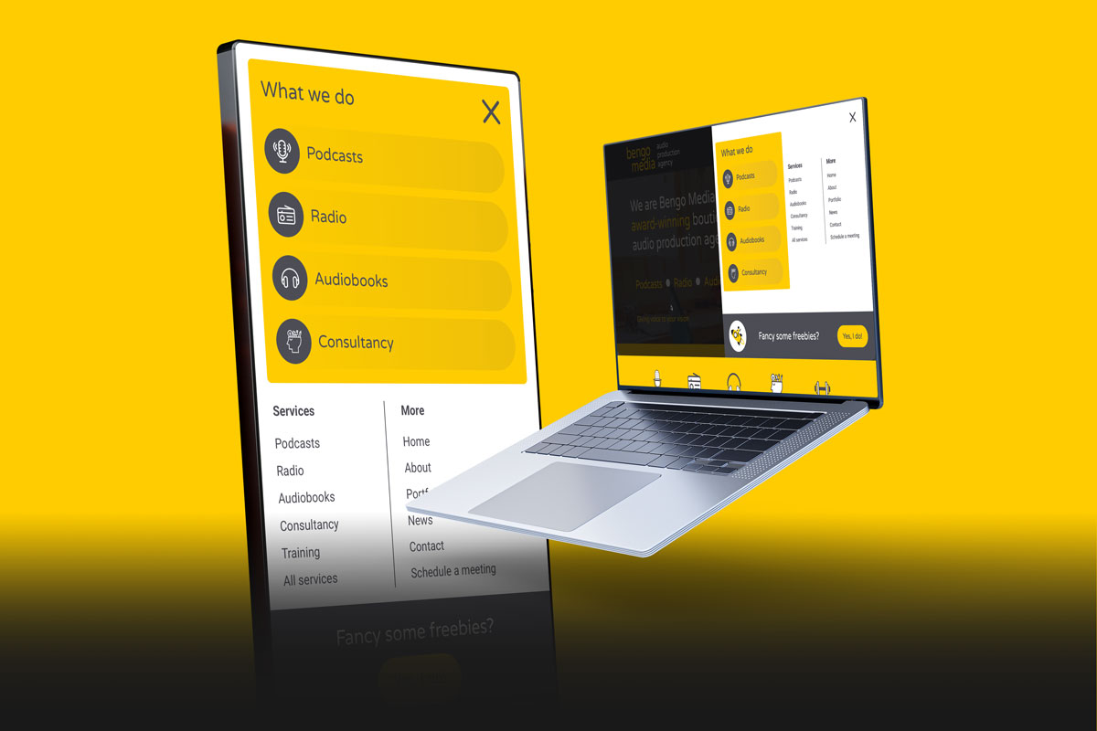
- Reframing the services area with a clear heading, “What we do”, to establish intent
- Redesigning the service panels into list-style navigation items that clearly behave like links
- Introducing strong hover states to remove any ambiguity about clickability
- Duplicating the four core services within the standard Services link list to support different user scanning behaviours
- Sense-checking the final structure with SEO input to ensure internal linking strength was maintained
Rather than relying on a single visual cue, the final design supports multiple ways of finding the same content.

Before
- A flat, single-column navigation where all pages were treated equally
- Core services were easy to miss despite being central to the business
- Users had to read and interpret the full list rather than recognising priorities

After
- Core services grouped and framed clearly under a “What we do” heading
- Service links redesigned to behave unambiguously like navigation, with clear hover states
- The four core services duplicated within the standard Services list to support different scanning behaviours
- Secondary pages retained in a clean, structured layout
Why this matters
This project is a good example of how small, well-considered changes can have a disproportionate impact. By listening carefully to feedback, stress-testing assumptions, and balancing design, usability and SEO, the navigation now does its job properly: guiding people quickly and confidently to Bengo Media’s core services. It’s not about making something louder – it’s about making it clearer.