
Penylan Preserves was an established artisan producer with a growing range of handmade jams, marmalades and preserves. The brief was to reimagine the brand’s look and feel in a way that respected its heritage and craft values, while creating a more confident, contemporary presence capable of supporting growth across retail and digital channels.
Candid Creative Studio led a full refresh of the brand identity, developing a clearer visual language that could scale across touchpoints without losing warmth or authenticity. This included the design and build of a new e-commerce website, bringing together product information, storytelling and practical detail in a way that felt accessible and inviting, while improving clarity for customers and stockists alike.
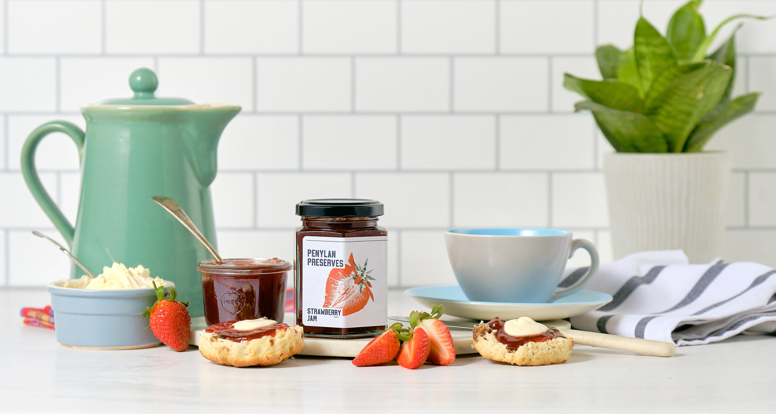
A central part of the project was the redesign of labels across the company’s full product range, covering almost 40 individual products. The new packaging system balances consistency with flexibility, ensuring each product is clearly identifiable while sitting confidently as part of a cohesive family. The result is a refreshed brand that feels thoughtful, recognisable and well placed to connect with its audience both on the shelf and online.

Before
The original labels had a charming, handmade feel, using kraft tags, ribbons and handwritten-style typography to signal small-batch authenticity. However, this approach was inconsistent across jars, difficult to scale, and lacked strong shelf impact. From a distance, the brand name was easy to miss, and the product range didn’t read clearly as a cohesive family.

After
The updated labels bring clarity, confidence and consistency to the Penylan Preserves brand. A bold, repeatable label system now puts the name front and centre, supported by simple, illustrative fruit graphics that clearly differentiate each flavour. The result is a much stronger presence on shelves and market stalls, with jars that look professional, recognisable and cohesive as a range, while still retaining a handcrafted, artisanal character. The new labels scale easily as the range grows, helping the brand move from hobby-style presentation to a retail-ready product.


