Brand
Consultancy
Digital
Print design
Social media
Website
WordPress
A complete launch identity and campaign for London Contact Centre Forum, bringing a new regional forum into the established Contact Centre Forum family with its own distinctive visual personality.
Client
London Contact Centre Forum
Sector
Corporate
Year
2026
Platform
Wordpress
Status
Live
Website design
A distinctive visual design that balances personality and clarity.
Responsive design
A seamless experience across desktop, tablet and mobile devices.
Built using Wordpress
A flexible CMS built for easy content updates.
Bookings and events
Integrated booking, registration and event management tools tailored to the operational needs of the organisation.
The brief
The Contact Centre Forum was expanding its established regional network with the launch of a new forum dedicated to London.
The challenge was to create an identity that felt unmistakably part of the wider Contact Centre Forum family, while giving London Contact Centre Forum enough individuality to stand confidently on its own. The new brand also needed to work across a broad launch campaign, from digital and social through to presentations, video and the new website.
Building the London identity
The London identity was developed as a new member of the existing Contact Centre Forum brand family. Rather than creating something entirely separate, the approach builds on the established visual system while introducing a distinctive London palette and graphic language.
A rich purple and vibrant teal give the new forum its own character, supported by sweeping arcs and connecting forms that reflect conversation, community and the connections the Forum exists to create.
A new home online
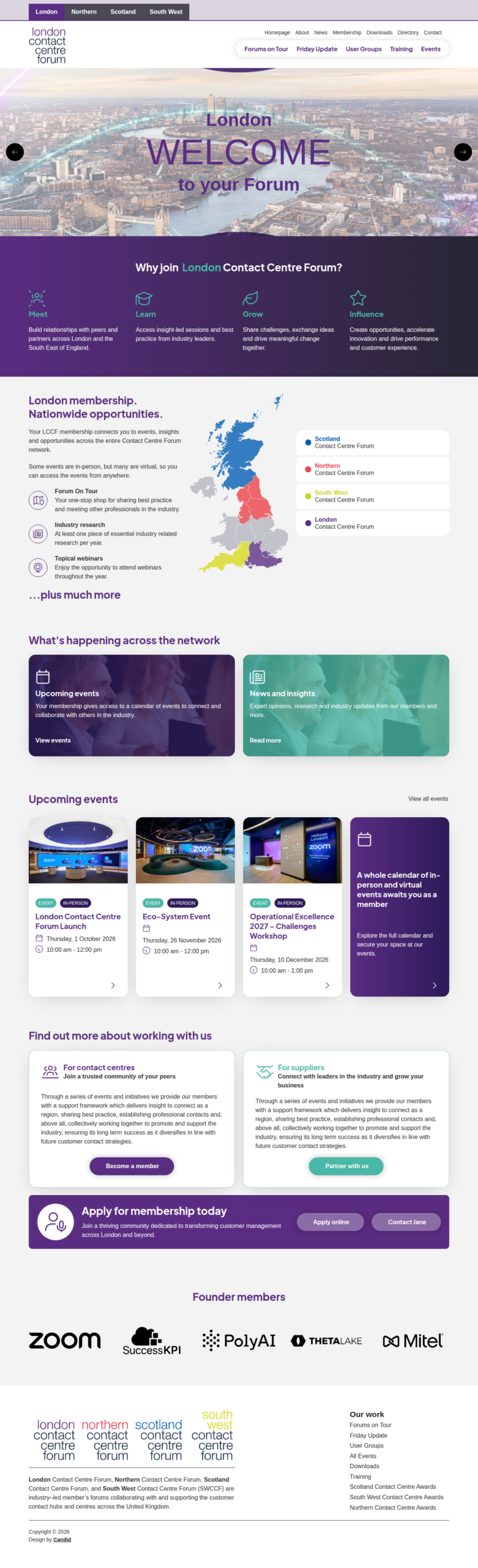
A new London section was designed and built within the existing Contact Centre Forum website, creating a dedicated home for the new community without separating it from the wider organisation.
The visual language established for the London brand carries throughout the site, while the structure makes it easy to discover upcoming events, understand the Forum, explore membership and apply online.
Launching London
Ahead of the official launch, a suite of social media creative was developed to introduce London Contact Centre Forum, build recognition and begin establishing its community.
Static graphics and animated content use the new identity consistently while allowing enough variation to keep the campaign feeling energetic across multiple weeks of activity.
Taking the story into the room
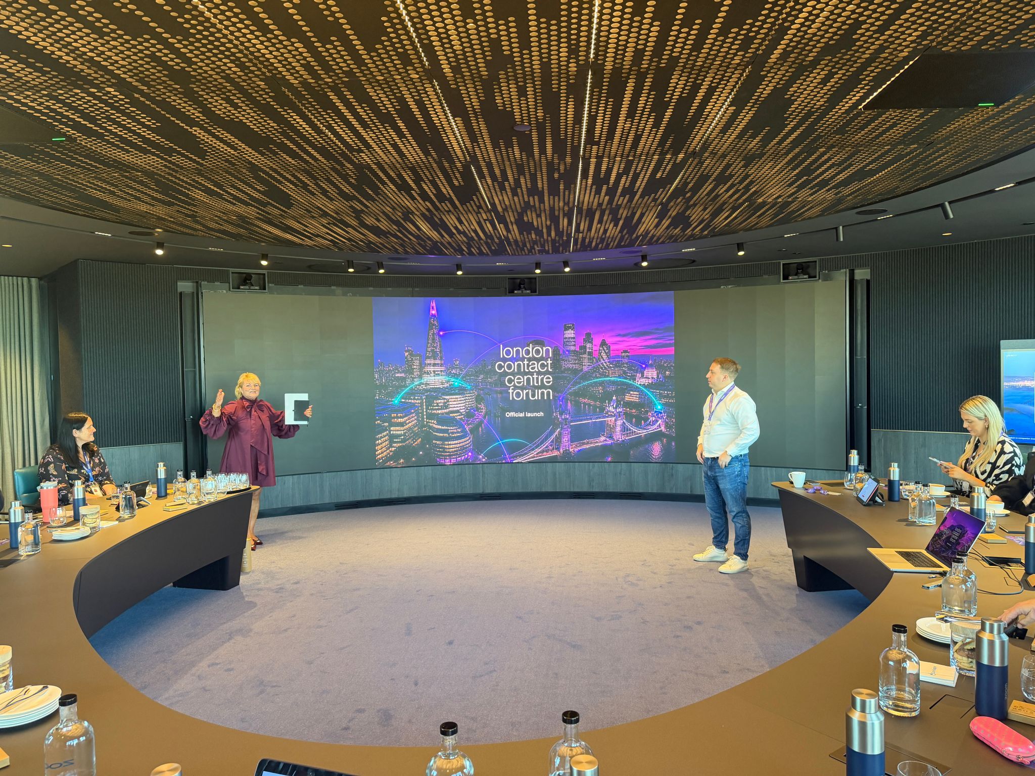
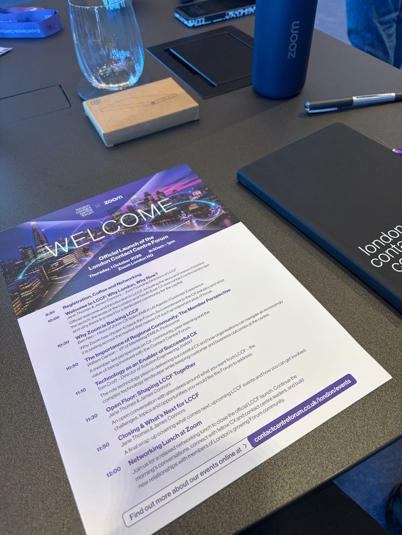
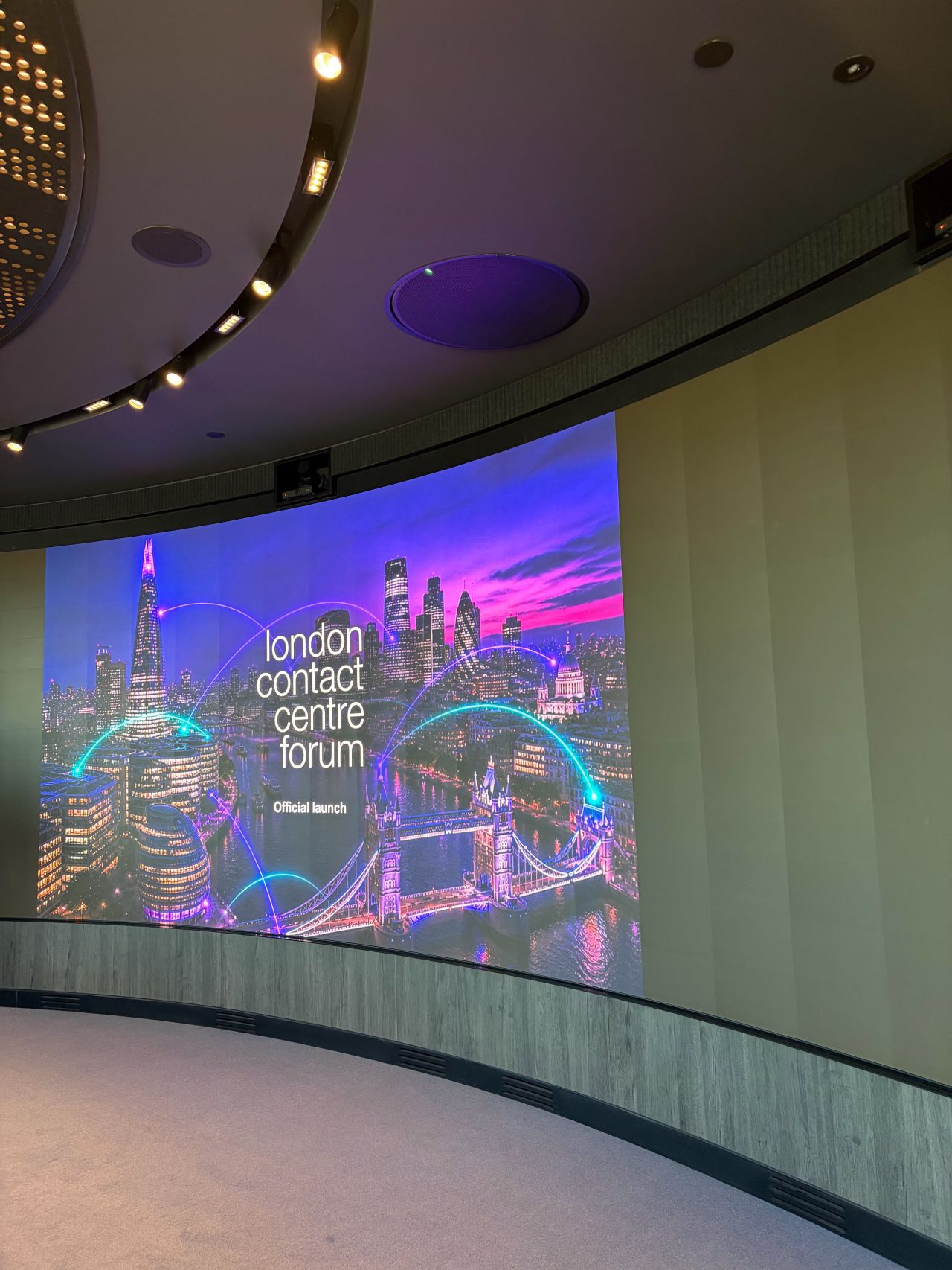
The identity also needed to work beyond the screen. A presentation deck translated the new visual system into a flexible format for introducing the Forum to prospective members, partners and stakeholders.
Bold typography, London colour and the connecting graphic language give the presentation its own presence while keeping the information clear and commercially focused.
Creating consistency
A concise set of brand guidelines brings the system together, documenting the London logo, colour palette, typography and graphic elements and providing a practical foundation for the brand as the Forum grows.
One launch. One connected identity.
From the first announcement on LinkedIn to the website, presentations and ongoing communications, London Contact Centre Forum launched with a complete visual identity designed to feel established from day one, while remaining unmistakably part of the wider Contact Centre Forum family.