Brand
Digital
Print design
Social media
Launching a new awards brand within an established ecosystem.
Client
Scotland Contact Centre Forum
Sector
Corporate
Events
Services
Brand
Digital
Print design
Social media
Year
2026
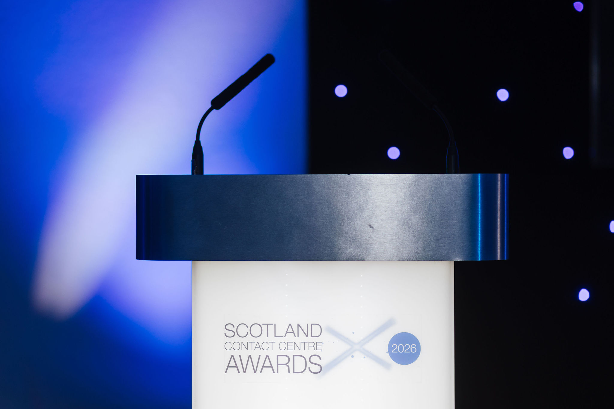
The Scotland Contact Centre Awards 2026 marked the launch of a brand new recognition programme, designed specifically for Scotland’s thriving contact centre sector. While the awards were inaugural, they needed to sit confidently within the wider Contact Centre Forum family, aligning with existing programmes in the South West and North of England regions while establishing a distinctive identity of their own. The challenge was to create a brand that felt credible from day one, signalling prestige and longevity, while visually differentiating the Scottish programme within the wider ecosystem.
At the heart of the project was the creation of a flexible identity anchored by a distinctive saltire light-cross motif. The logo combines a clean, modern typographic treatment with a subtle celebratory device, evoking stage lighting, recognition and achievement. The crossing beams form a focal point that feels both dynamic and refined, allowing the brand to convey prestige without resorting to overly traditional awards tropes. The circular date marker reinforces the sense of an annual programme, helping establish continuity for future editions while remaining adaptable across formats.
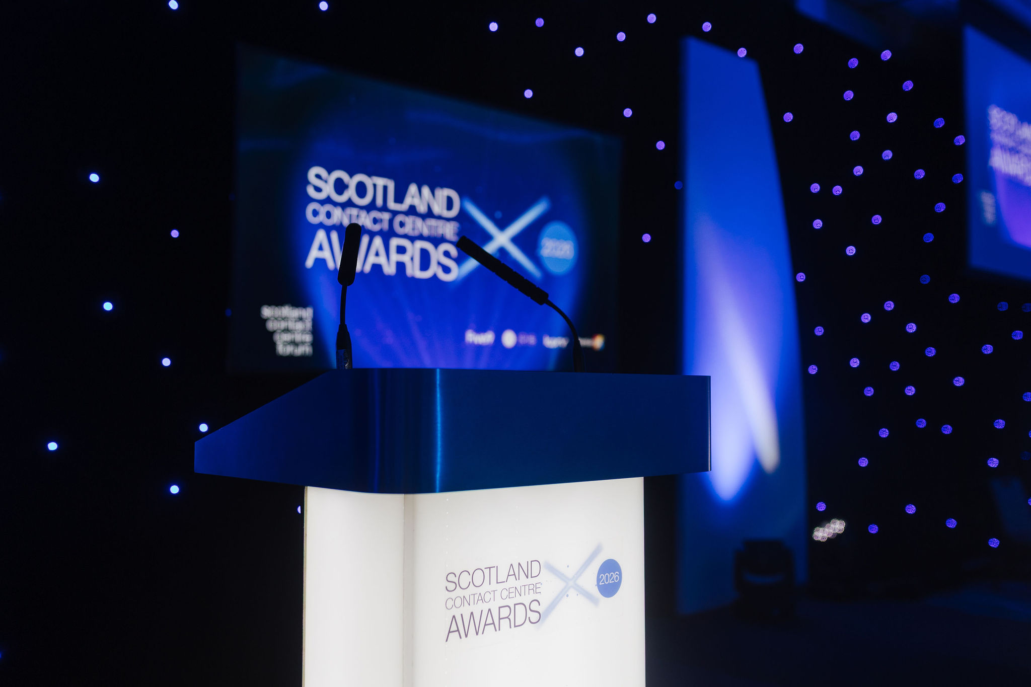
The colour palette builds on the established blue used across the Contact Centre Forum network, but introduces richer, darker tones to create a more premium awards feel. Gold accents and subtle particle effects add warmth and celebration, while maintaining clarity and professionalism. This balance was important. The brand needed to feel aspirational and black-tie appropriate, yet still rooted in the professional, people-focused nature of the contact centre industry.
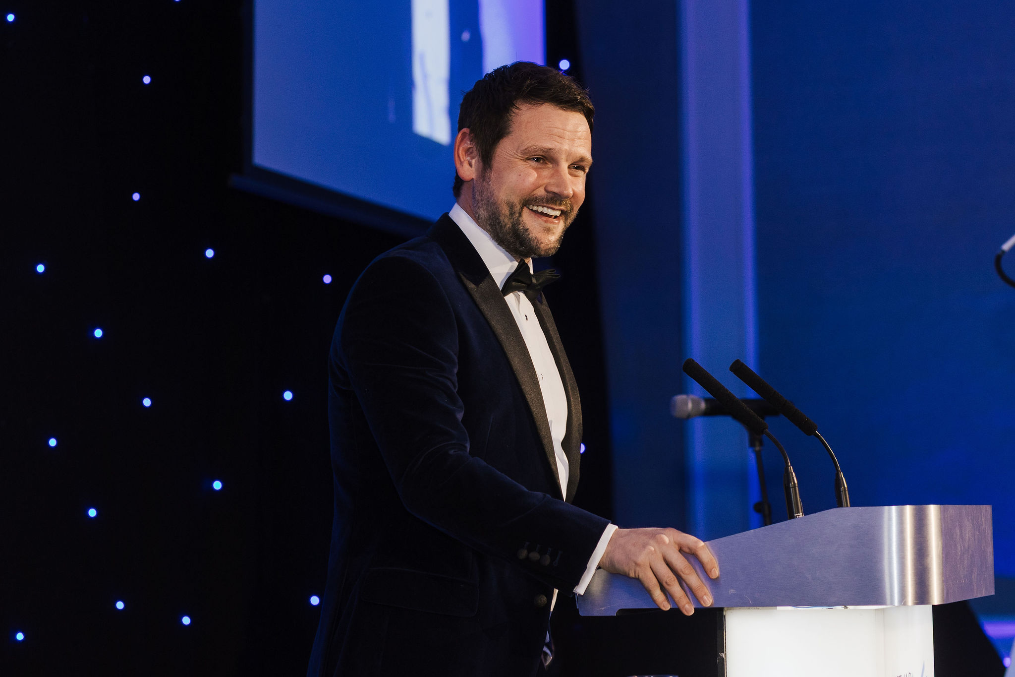
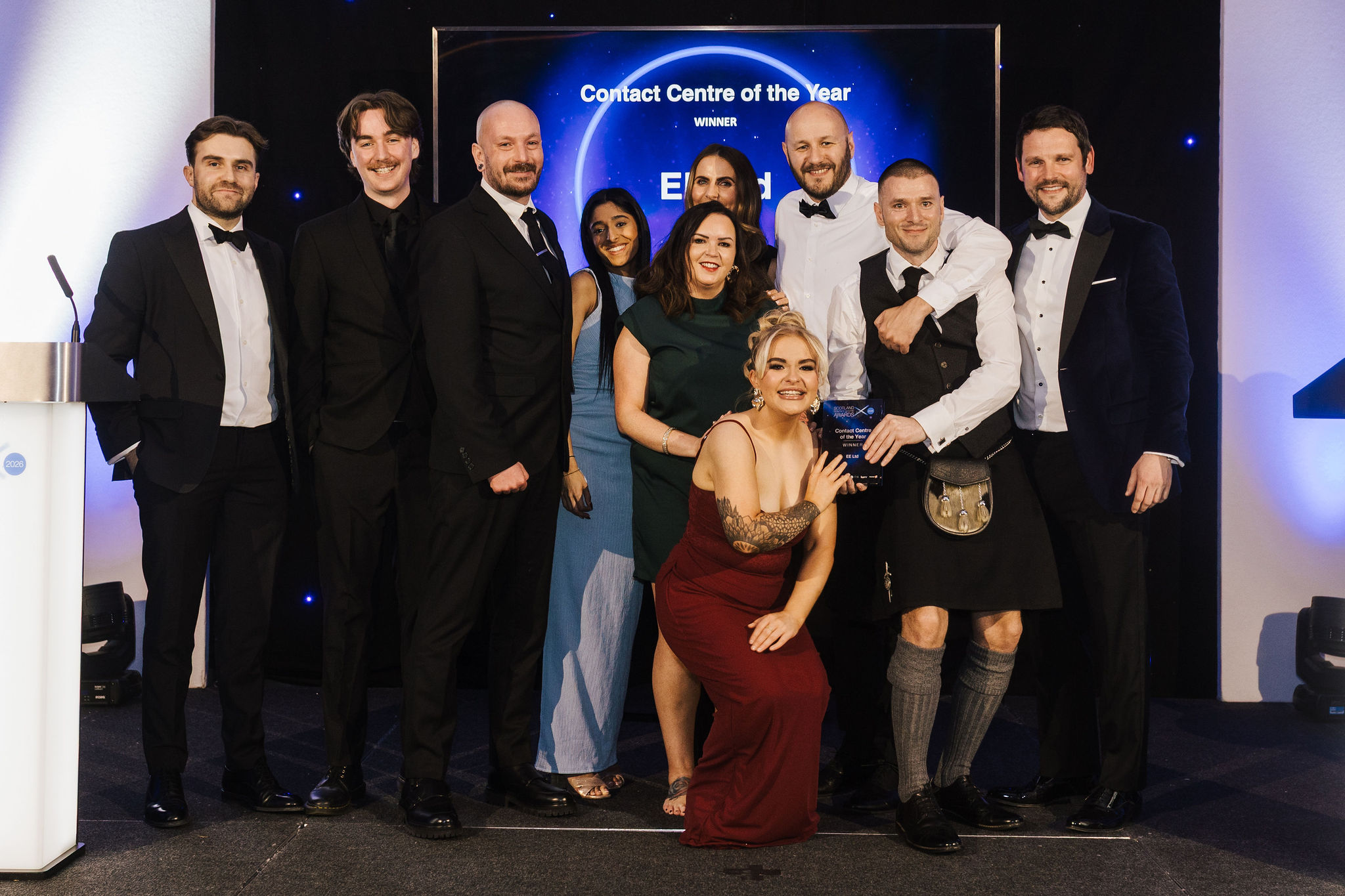
From the outset, the identity was designed as a complete system rather than a single logo. It needed to perform consistently across print, social media, presentations, sponsorship materials and a dedicated awards website. The crossed-light motif becomes a recurring device throughout, acting as a visual anchor across judge announcements, entry campaigns, sponsorship packs and event promotion. This repetition helps build recognition quickly for a new awards programme.
Print materials were developed to support both sponsorship sales and participant engagement, balancing editorial-style layouts with commercial clarity, ensuring the programme feels both prestigious and accessible. Supporting collateral, including awards toolkits and promotional graphics, maintain consistency through typography, colour and repeated visual cues.
Social media graphics were created as a flexible modular system. Announcement templates for judges, finalists and key milestones use bold typographic blocks layered over subtle celebratory backgrounds. This allows the awards team to maintain visual consistency while quickly producing new content. The system was designed to scale throughout the awards timeline, from launch through to shortlist announcements and the awards dinner itself.
The website extends the brand into a digital-first environment, translating the visual language into responsive layouts optimised for mobile viewing. Strong typography, clear calls to action and consistent use of the light-cross motif help establish a coherent experience across all touchpoints. The result is a brand that feels cohesive whether encountered in a social post, sponsorship document or dedicated awards page.
Although the Scotland Contact Centre Awards were launched as a new programme, the branding deliberately acknowledges its place within the wider Contact Centre Forum family. Shared typographic principles and colour relationships ensure visual alignment with sister awards, while the distinctive Scottish execution gives the programme its own identity. This approach reinforces both local relevance and national credibility.
All photography by Jen Scott.
Outcome
The final outcome is a premium, scalable awards brand designed to grow year on year. From logo to website, print to social, the identity positions the Scotland Contact Centre Awards as an established and respected programme from its very first edition, while fitting seamlessly into the broader Contact Centre Forum ecosystem.