

Candid Creative Studio was commissioned to design and build a dedicated Employee Ownership mini-site to sit alongside Sonic’s main website. The objective was clear: create a human-led, reassuring and visually confident platform that reflected the company’s family heritage while positioning it for future growth.
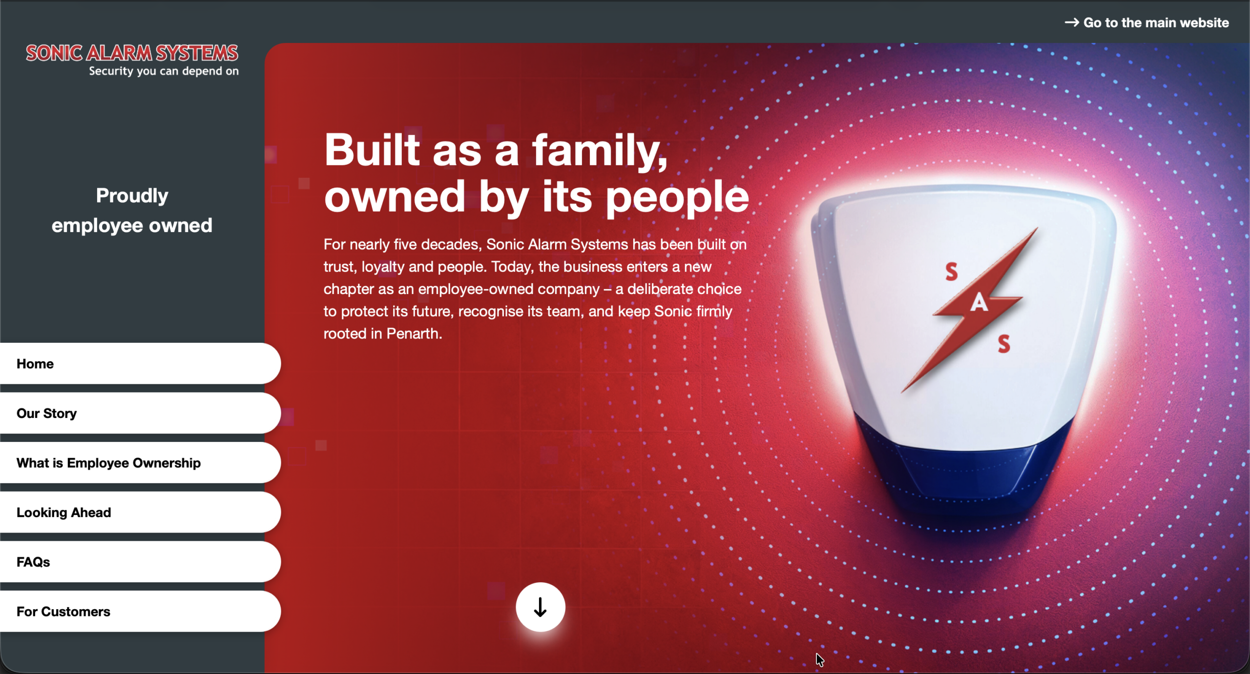
The result is a structured multi-page experience that balances clarity with emotion. The homepage acts as a gateway, introducing the story with bold typography and a strong red security grid visual language. Supporting pages expand on the company’s family roots, explain the Employee Ownership Trust model in plain English, and provide detailed FAQs to reassure customers, staff and partners.
Rather than corporate jargon, the tone centres on people: legacy, loyalty and shared future success. The design system reinforces trust and protection through subtle grid devices and strong brand colour usage, while maintaining generous whitespace for readability.
The mini-site now functions as:
- A long-term digital asset
- A reference point for customers and suppliers
- A PR and editorial support platform
- A recruitment and brand credibility tool
By combining narrative clarity with strong visual direction, the project helped Sonic Alarm Systems position employee ownership not as a transaction, but as a confident new chapter.
After
The layout deliberately breaks from standard website convention. Instead of a traditional top navigation, the mini-site uses a fixed vertical menu — a confident structural decision that reinforces clarity and permanence. The navigation almost reads like a security control panel: physical, tactile buttons aligned vertically, echoing the language of engineered systems rather than corporate marketing. Subtle hover animations add feedback and interaction without distraction, strengthening the sense of control and precision. The result is a layout that feels distinctive yet intuitive, scaling seamlessly across desktop, tablet and mobile while maintaining its architectural integrity.